Showing posts with label Papercrafting. Show all posts

Wednesday, 6 June 2018

CVS | Too Cool For School

Good Day Friends,
Hello! I'm sharing with you a layout I created using the very versatile, You Rock collection. I decided to document this week a photo of my eldest little meatball on her very first day of Junior Kindergarten. As you can tell from the photo, she's full of spunk and sass and was such a great sport about posing for a few pictures. You Rock has some very cool and "school like" elements and so I thought it perfect to use.


See what I mean about the school like themed elements? The background paper looks like school writing paper, the text paper and the ruler type embellishments that were part of the cut apart border sheet were absolutely perfect! I was excited to be able to think outside the box to document this photo even if this collection is geared towards boys: It totally works in documenting my little girls very first day of school.

I cut strips from the border sheet and a couple patterned papers and adhered them to the top of the background paper giving my background paper some visual interest and a small amount of texture.


My photo measures roughly 4x4 and I matted it with papers from the collection as well as a frame from the Die Cut Ephemera. To embellish, I created clusters behind the left and right sides of the photo. And, that's also where I added my title using black, foam Thickers. I used the Die Cut Ephemera and the Accessory Stickers to create my clusters and add my embellishing. 


Proudly, I also used up a package of Enamel Shapes! I'm happy! Sounds silly but sometimes I refrain from using my supplies because I would like to "save" things for another layout and then the supplies don't get used because I forget. It can't just be me, right? 😝


Continuing with the embellishing, I used the tiny words from the Accessory Sticker sheet to convey the journaling message I wanted to convey. I do this in place of formal journaling. If there is something specific that I'd like to document, I do that on the back of y layout since I don't write on the front of it. I dislike my penmanship and so instead of "ruining" a layout with my own writing, I opt to do it that way instead. It's kind of like cheating but it get the job done!
I also added a Flair Button that sits atop a nest of yellow sewing thread that was just wrapped around my fingers and adhered down.

I hope you all enjoyed my layout for this week as much as I enjoyed creating it!
Have a wonderful rest of the week!
xoLina


Sunday, 20 May 2018

CVS | Precious Girl

Good Morning Friends!
Welcome to the blog! Lina here with you today showing this layout I created using the More Than Words collection from Cocoa Vanilla Studio. I've decided to document a sweet picture of my eldest little and myself while we were on vacation last year in Mexico. And to be honest, I don't know how I hadn't scrapbooked it until now :P


The paper in this collection is seriously something else... it's so beautifully done and every sheet makes my little heart pitter patter. For this particular layout, I used the floral sheet called Precious (fittingly enough), the coral sheet Called Sketchbook and Radiant which is that lovely black on white random polka dot. You see, I could not decide on which sheet I wanted to use so  I used many LOL!

My photo is printed in black and white and is matted with random pieces of paper I had from the collection. The sweet black 2x3 card you see to the left of my photo is from the Collage sheet. It was perfect for this layout and the message I was trying to convey. It also acts as a sort of sub-title for my layout.


I created a few clusters in terms of embellishing on my layout and created a visual triangle. I have two larger clusters and one smaller one in the top right hand corner of my photo. To embellish, I used the beautiful ephemera from the Die Cut Ephemera pack. And, I also used stickers from the Accessory Stickers page. Both two of my favourite!

For my title, I used the word "precious" from the Chipboard Titles package and the word "girl" is a AC Thickers in Goldie. I love the combination of fonts and colours for title work. I feel it just makes the entire title fun!


Two things to finish off my layout... First, I created a nest of yellow thread and a home for my flair button to sit. I feel it gives a great foundation and a bit of texture to the entire layout. Secondly, I feel a heathy scattering of Enamel shapes is always a good thing! :)

I hope you all enjoyed my layout today and will be back tomorrow to see what the other ladies are up to :)
xoLina


Sunday, 6 May 2018

CVS | Easter Beauties

Hello Scrappy Friends!
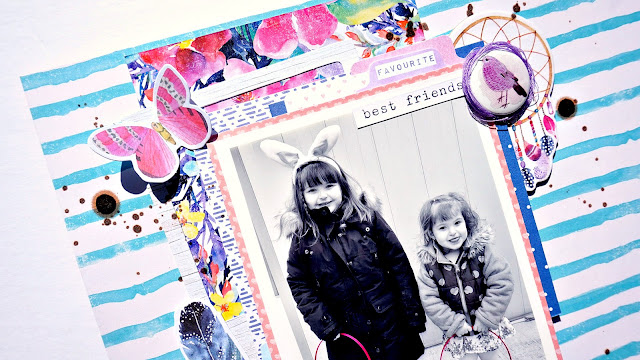
It's Lina here this morning sharing my layout using the gorgeously designed, Bohemian Dream. I documented a photo of my littles from this past Easter and this collection compliments the colours perfectly!


I began with my photo this time because I knew I wanted to use Bohemian Dream for this layout. I started on my phone using an app called Color Splash and made my image black and white and left my girl's Easter Baskets in colour. I wanted them to pop and not compete with the papers I was using. Instead, I wanted them to compliment each other.
Next I chose my background paper and that blue and white stripe, Wild Flower was screaming my name. Cutting a piece of the Abundant sheet of paper, I used it as a layering piece behind my photo.

Next, for the matting of my photo, I took pieces from the 6x6 paper pad as well as a couple scraps I had from the collection and layered behind my photo. I also used a photo frame from the Die Cut Ephemera to act as a layering piece. My photo is then popped up on foam for lift and dimension.


For my title, I used two different fonts from Thickers. One is Adorn and the scripty one in Rainboots. I just adore the look of a fun and playful title with multiple fonts.


Next, the fun stuff.... Embellishing! I lovingly sifted through pieces from the Die Cut Ephemera and the Accessory Stickers. I also chose a Chipboard Accent piece, Dream Catcher, to adorn the top right hand corner of my photo and floral layering piece. For some added drama and lift, I decided to add some foam behind a few of the flowers to ensure they jumped off the page and did not get "lost".
 
To complete my layout, I added some of the phrases from the Accessory Stickers sheet to convey some of my "journaling". I also added a Flair Button which sits within a nest of thread. Lastly, I added some splatters with some black ink spray.


And that's it!
I hope you enjoyed my layout! Have a wonderful day!

xoLina


Tuesday, 20 March 2018

CVS | Love You

Hello, Hello, Hello!
This morning sharing a layout I created using the fabulous, More than Words collection from Cocoa Vanilla Studio. This week, I scrapbooked and documented a picture of my little family. The photo was taken this past summer, so it's a little dated and my girls aren't so little anymore. Still, it needed to be documented :)


The focus this week on the blog has been paper. So, in true "Lina style", I used all the paper. And how else better to do so then to use a cut file and back each word with a four different patterned papers? That's what I did in this case and I just adore the result! The cut file is a freebie from Paper Issues and I cut it from that gorgeous, grey and white washed woodgrain. It's called Precious and it really is so. With my photo, I matted it with a few different pieces of patterned paper, again, going with the theme of the week.


Next, I worked on my title. I used the Chipboard Titles to create my title of, "Love You". Very creative I know, but let's be honest here... I love my tribe and so it worked :P
I placed some foam sheet cut into tiny strips behind the words to prop it up. The words are placed somewhat on the photo and because the photo had dimension to it, the words weren't balanced. Adding the foam behind my words gave them the stability they needed.


I had an idea in mind in how I wanted to embellish the layout. On one of the cut apart sheets, there is a 4x6 card full of black and white butterflies. I cut them out and built my embellishing around them. I took butterflies from both the Die Cut Ephemera package and the Vellum Accents package and created my flying butterfly cluster. I made the butterflies look as if they were in flight, together starting from the bottom right, flying up and across my page into the top left. I simply adore this. It really adds quite a bit of whimsy to my page. I also took the hearts from the Chipboard Titles package and tucked them amongst my butterflies.


Nestled among the butterflies, lies a perfectly placed Flair Button surrounded by a nest of pink thread. I also added some of the same pink thread under the bottom left hand corner of my photo for some added interest. I added some tiny words and phrases from the Sticker Accent sheet. Lastly, I sprinkled a good amount of Enamel Shapes around the page to carry the colours throughout the page. And, voila! Done!
I hope you all enjoyed my layout!
xoLina

Tuesday, 6 March 2018

CVS | Sweet Moments

Good Morning Scrappy Friends!
Lina here with you today sharing a layout I created using my fave, the More than Words collection from Cocoa Vanilla Studio. I am scrapbooking a photo of my eldest daughter, Alessandra taken the other day at school when the parents were invited to class to share in a poetry recital. My girl was so happy to see both mom and dad in the audience and I snapped this quick photo of her. And as the title states... a sweet moment. Here's what I created...


I began with the background sheet called Radiant a cut the word "moments" using a simple, uppercase font. Then, I used my watercolour paints to create a soft and beautiful watercolour wash. I used tones of peachy pink and a blueish aqua. I took inspiration for both the colours from the in the collection. I then backed the cut word with a sheet from the 6x6 paper pad. That black and white floral gets me every time. ❤


I then worked on matting my photo. Now, I love layers so I was sure to add a few sheets of patterned paper from the 6x6 paper pad plus any "scraps" I had already cut into for previous layouts. Lots of lovely paper and colours makes my heart happy! I then popped the photo onto a piece of foam dimension.


I then began my title. Having already completed the "moments" aspect of my title, the next part was easy! I used the word sweet from the Chipboard Titles. I just adore the mix of fonts to create my title.


Now, my favourite part... to build and create the clusters of embellishment around my photo. I took pieces from the Die Cut Ephemera pack, the Vellum Accents and the Chipboard Stickers. I also added some metallic silver thread and created a nest for my Flair Button to sit within.


I thought that my layout needed a bit of anchoring, so, I added a strip, cut at an angle to the bottom of my layout. I also added some embellishment with some ephemera there as well. Lastly, a healthy sprinkling of the Enamel Shapes and some silver Distress Spray. And voila! My layout is complete!

I thank you for stopping by today!
xoLina

Saturday, 17 February 2018

CVS | It's a Wonderful Life

Good Day Friends!
For my layout this week, I'm using the beautifully created More Than Words collection from Cocoa Vanilla Studio, my new fave!
The photo I am documenting today is of my two little meatballs taken this past summer. Both are sitting on a large rock, enjoying their childhood and life!


I chose Sketchbook as my largest layer of background paper. It's absolutely stunning! The I layered Noteworthy and Gossamer on top, smaller and slightly angled. I placed my 5x5 photo that I printed in black and white, in the center. I matted it with papers from the 6x6 paper pad which are perfect for that exact purpose.


I love embellishing with any thing Cocoa Vanilla Studio. Every piece is wonderful and so usable! I used that black and pink tag and surrounded it by florals, leaves, and butterflies. How perfect! Those pieces are found in the Die Cut Ephemera pack.

Next, I did something I have never done before on a layout... I stamped directly onto it! Ahh! A scary thought but I went for it and I'm glad I did! The stamp set is perfect for cards AND layouts! I used Versafine ink in black.
I added a smaller cluster in the top right hand corner using some of the Die Cut Ephemera, Accent Stickers and a wonderful Flair Button. The button is surrounded by metallic silver thread and creates a bit of texture and visible interest.
For my title, I used a mix of alphas. the "wonderful" is from the Chipboard Accent Stickers. Both the others are from my stash. That glittery font I used worked perfectly with the collection.

Lastly, I added some ink splatter with some metallic silver ink spray and called it done!
That's it for today! I hope you enjoyed my layout because I'm glad you stopped by ☺️
Big Hugs,
xoLina

Monday, 5 February 2018

CVS | Cherish These Moments

Hello Dear Scrappy Friends,
I'm excited to share with you my first creation using More Than Words from Cocoa Vanilla Studio! I am smitten with this collection. Every time I fall in love with a collection and claim it as my favourite, Zoe comes along and creates another stunner. I mean c'mon, it's sooo pretty!
The photograph I chose to scrapbook is a picture of my husband and myself. Fitting as how the theme this week on the blog is about love. ❤️


For my background, I wanted to create some visual interest so I started with layering some of the beautiful patterned paper sheets including; Precious, Gossamer and Noteworthy. I cut down stripes and adhered them down horizontally onto Radiant, that wonderful white with black dots. Simple and sweet!

Then, I worked on matting and layering papers behind my photo. I kept it simple this time around knowing that there would be a bit extra going on with all the patterned papers I had already used with my background. I printed my photo in black and white because I knew it would work perfectly with the collection. I was meant to be! I like a little lift and dimension on my layouts, so I adhered my photo and matting onto some foam sheet before sticking it onto my background paper.

Next, I worked on my title using the word "cherish" from the Chipboard Words and "Moments" from the Chipboard Accents sheet. For the word "these" I pulled an older alpha from my stash. These are Mini Markets in blue and cream.
  
Next, my favourite... embellishing! I used some of the gorgeous florals from the Die Cut Ephemera pack, a feather and that beautifully quoted tag that reads "Live for the moments you cannot put into words." I continued to embellish using the tiny word stickers that are included on the Sticker Accent sheet. They always manage to convey the message I'm trying to convey. <3


I thank you all for being here today and letting me share my layout with you. I appreciate it!
Have a wonderful weekend!

xoLina

Wednesday, 10 January 2018

Chocolate Chip Pancakes

Hey Guys!
Hope everyone is having a wonderful start to the new year. I know I am!
Today's layout is one that is wayyy overdue. I've had this collection from Paige Evans and Pink Paislee, Turn the Page for months! Like sitting and waiting for me on my desk in plain sight, screaming to be used! So, here I am, sharing a layout created with the collection in all it's splendor!


I began this layout with a cut file from Paper Issues, it's free and you can find it here: https://paperissuesstore.myshopify.com/collections/free-files/products/heart-grid-free-cut-file. I cut it using my Cameo and backed it with that gorgeous rainbow butterfly pattern. I chose that particular sheet because the red's in both the paper and photos most closely matched. The other reds were lighter and didn't fit the over all colour scheme.

As always, I matted my photos with papers from the collection and in this particular instance, I used the handy 6x6 paper pad. It's perfect for matting photos. I then popped my photos on dimensional foam for lift.


I decided to then work on my title. I pulled pieces from the Journaling Spots and gave a home for my title to actually live. I didn't want to put it directly onto the layout. It would just get lost by doing that. For my title I used the Thickers in New Day from the collection and the smaller font is from October Afternoon in Mason Jar.

I then went through the Ephemera pack and chose my favourite pieces to embellish my page. Pulling pieces from the Chipboard sheet and stickers, I created visually pleasing clusters in and around my photo.


To finish my layout, I used some Heidi Swapp Color Shine in Gold and sprinkled some gold lovin' around my page. This layout came together rather quickly and I am super pleased about the way it turned out. It's my new fave!

Thanks so much for stopping by!
xoLina

Wednesday, 6 December 2017

CVS | Good Tidings

Good Morning Friends!
Lina here with you this morning to share I layout I created for this week's theme over on the Cocoa Vanilla Studio Blog of creating a Christmas layout using non-Christmas items. I loved this week's challenge, it forced me to think outside the box. Sometimes I get stuck in a rut but having something like a theme or a sketch to work with totally brings the creativity out in me.

Here's my take...


What a better way than to push my creativity than to use the gorgeous Bohemian Dream collection for a Christmas layout? Haha! It's full of beautiful florals and I thought to myself, "Why not?"
I decided to start this layout with a cut file, so I Googled "geometric Christmas Tree and found one I liked. I then used the Silhouette Design Studio to trace and then my Silhouette to cut it all out. I cut it out twice, once for the background and a second time so I chose a different patterned paper for the outline. I then flipped the original navy, polkadot called Abundant over and used the beautiful floral design in the back to fill in my pieces in the tree. I believe from start to finish, this process took about 15 minutes or so. I just love the effect and feel it's totally worth the extra effort.


I then continued to matte my photo. For this, I used pieces from previously cut into sheets as well as some papers from the 6x6 paper pad. I also used a bit from the cut apart sheet. Love this method!


For the title work, I chose the word "good" from the Chipboard Titles sheet. I knew I wanted my title to be white so I just left them as they were. Then, I went through my stash and picked out some white Thickers in Daiquiri and finished my title, reading "Good Tidings". I think it worked out pretty well. Totally complimented the theme and super simple!


Continuing forward, I worked on my embellishing. I chose pieces from both the Die Cut Ephemera and the Vellum Accents packages. I created my clusters using these as foundation pieces. Creating one cluster in the bottom right and a smaller on in the top left of the photo. I also added embellishments from the Chipboard Accents such as the hearts.


Next, I wanted to use a button from the Flair Buttons and so I chose the minty one that reads, "One of a kind." I created a nest of sorts using metallic gold thread that I wound around my index and pointer fingers and placing on my layout. I put some glue in the middle and then added my flair directly on top. It creates a nice little place for the flair button to sit.
To decorate my tree, I used the Enamel Shapes... an entire package. LOL! How very liberating to use and entire pack of something. Anyhow, I used them to dress up my tree and act as a sort of baubles. So cute!


Lastly, I used some HSCS in Gold to add some gold splatters around my page, mainly focusing around my clusters. Done!

I hope you enjoyed my layout today as much as I enjoyed creating it! Have a wonderful rest of your day!
xoLina ❤️


Monday, 20 November 2017

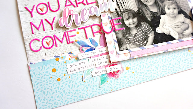
CVS | You Are My Dream Come True

Good Morning Fam,
Hope you all are having a lovely day thus far! Sharing my latest creation with you for Cocoa Vanilla Studio. Our theme this week was Gratitude. And, like most parents, I am grateful for my little meatballs. They have made me the happiest of people and saved me so many times. I will be forever grateful for their existences ☺️


This is what I created using the newest line, Bohemian Dream...


I know I mention this alllll the time, but I am completely and utterly smitten with this collection. It's just beautiful!
I began with the back ground sheet which is called Kaleidoscope. It's that gorgeous, whitewashed woodgrain you see. Next, I took about a 2.5 inch cut from the light blue sheet and a sliver from the dark purply blue horizontal stripe, and created my base. The entire layout is bottom heavy and I love how the papers act as an anchor for my photo, title and embellishments.

Next, I always work on my photo. I chose a few papers from the 6x6 paper pad and one full sized sheet and matted my photo. Then I popped it up on foam for dimension. I love the over look of this technique; It really allows the photo to jump off the page. In this case, the photo is printed in black and white. I printed it in both colour and Black and white but I liked how the black and white photo looked best against the colours of the collection. 


For my title, I worked with the "dream" piece from the Chipboard Stickers and worked around it using Thickers in Hardcover, a hot pink puffy sticker type. The colour really works well with all the pinks in the collection. I'm happy with how the title worked out. 

Now for my favourite part... embellishing. I used pieces from the Die Cut Ephemera package as well as florals from the Vellum Accents. I really had to stop myself from using "all the things" 😛 I created clusters in the top right of the photo and the bottom left; Layering both ephemera and vellum.

When it came to embellishing, I wanted to incorporate something to signify me and my littles. I used 3 vellum butterflies from the collection, one larger a medium and a small. I only glued the middles down and then folded up the wings to simulate the butterflies in flight. I think this is my most favourite element on the entire layout. It makes my heart happy. ❤️
I then added a few choice tiny words from the Accessory Stickers sheet. You friends already know how I feel about these. LOL! I'm in total love with them!

I also added some gold metallic thread in nest formation and rested a Flair Button on top, using the beautiful pink butterfly flair.


To finish off my layout, I added some HSCS in Gold and some Enamel Shapes. They're both the most awesome finishing touches!
 
I hope you've enjoyed what I've shared today as much as I've loved creating it! Thank you so much for joining me today on the blog!

xoLina